1A+
Run by Catarina F. Saraiva and Constantin Peyfuss, 1A+ is an autonomous studio for research and shared knowledge.
⸻
O nosso trabalho atua nas interseções entre cultura popular, experiências diaspóricas e narrativas sub-representadas, investigando como práticas visuais e performativas articulam identidade, memória e imaginação — seja através de discursos políticos explícitos ou de explorações puramente estéticas.
A 1A+ reflete uma base física e simbólica: começa no nosso lugar — a Unidade 1A — e expande-se com o +, que representa os artistas que expõem, as pessoas que visitam e a comunidade alargada que dá forma ao espaço. O + simboliza colaboração, diálogo e a constelação sempre crescente de contribuições criativas.
Our work engages with the intersections of popular culture, diasporic experiences, and underrepresented narratives, examining how visual and performative practices articulate notions of identity, memory, and imagination —whether through explicit political discourse or purely aesthetic exploration.
1A+ reflects both a physical and symbolic foundation: it begins with our location — Unit 1A— and extends with a +, representing the artists who exhibit, the visitors who engage, and the wider community that actively shapes the space. The + stands for collaboration, dialogue, and the ever-growing constellation of creative contributions.
Rua Lourenço Pires de Távora 1A, Almada
⸻
October 2025
Title of Work: Intentional Grain
Artist: Catarina F. Saraiva
Medium: photography
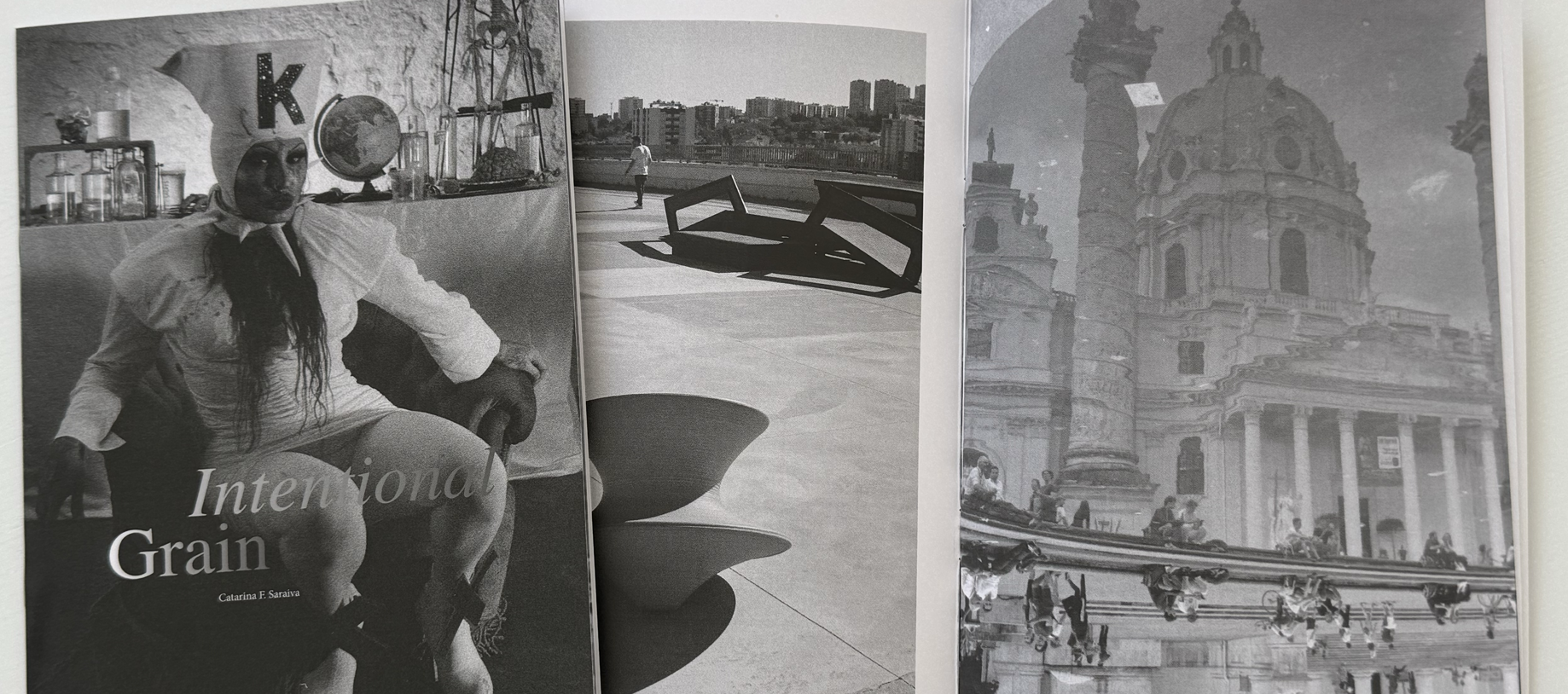
In a world obsessed with crisp pixels and flawless compositions, Catarina F. Saraiva chooses blur. The São Paulo–based photographer calls herself “at home everywhere,” and her project Intentional Grain feels like a manifesto for the beautifully imperfect — a quiet revolt against the sterile precision of contemporary photography.
Catarina’s relationship with the camera began not from artistic ambition, but from an inability to stop looking. She describes photographing “instinctively, often without knowing why,” collecting light the way others collect objects, slowly, sometimes accidentally. While many chase the singular decisive moment, she gathers the quiet, unnoticed ones: a reflection on a tiled floor, a silhouette passing, the residue of a half-heard conversation. Her images don’t shout; they murmur.
Intentional Grain is her first attempt to weave years of fragments into something cohesive. It’s not a portfolio and not a diary, something in between. For Catarina, the camera lives “between distance and closeness,” the perfect metaphor for photography’s paradox: being connected to a moment while remaining slightly outside it.
What makes the project striking is its embrace of what others might discard. Some images are shot on expired film, others with whatever camera was available. The grain, traditionally a flaw, becomes expressive texture. “I’m not interested in perfection. I’m interested in presence,” she says. The work honors the moment when the ordinary becomes unforgettable simply because you paused to see it.
Described as “a living archive of places I’ve been, moods I’ve carried, and people I’ve loved (or just passed by),” the project straddles the personal and the universal. In a hyper-curated visual culture, Catarina’s focus on the unperformed becomes quiet resistance.
At its core, Intentional Grain is about making peace with what stays blurry. Imperfection becomes intention; blur becomes meaning. The project invites viewers to slow down, to see more gently, and to rediscover the truths that live not in sharp focus, but in the tender blur of a life fully observed.
⸻
August 2025
Title of Work: Suprememememe — Semiotics of a Sellout
Artist: Dilettante X
Medium: printed vinyl
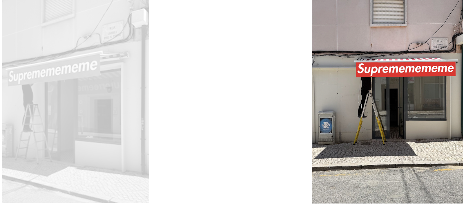
In Suprememememe, the awning became a temporary semiotic battleground — where branding, authorship, and irony collide. The work mimics the unmistakable white-on-red logo popularized by Supreme, a brand that built its empire by copying Barbara Kruger’s visual language: Futura Bold Italic, declarative text, confrontational framing. Kruger’s work — sharp, feminist, and anti-consumerist — was never just a style. It was a critique of the very mechanisms Supreme now embodies.
Here, the appropriation loops back. Suprememememe is not a homage — it’s a hijack of a hijack. A détournement of a détournement. It holds up a mirror to the absurd cycle in which critique becomes branding, and rebellion is mass-produced.
The syllabic glitch — mememememe — does more than raise a smirk. It mimics the recursive logic of the meme economy: self-reference, flattening, repetition. Meaning dissolves into virality. Identity becomes a loop. It’s the language of late capitalism, where everything — including dissent — is up for resale.
And then there’s the font. Futura Bold Italic, designed in 1927 by Paul Renner, once stood for clarity, rationality, and a better tomorrow. It was modernism’s promise, built on geometry and progress. But in Suprememememe, that promise unravels. The future has been resold, repackaged, and slapped on sweatshirts. The font that once imagined utopia now speaks in the voice of luxury drop culture — exclusive, empty, and endlessly reproduced.
Installed on a modest storefront in Almada, the piece lands like a provocation. In a city on the brink of gentrification, it reads like a corporate flag raised on contested ground — a graphic signifier of cultural colonization. But instead of retreating into cynicism, Suprememememe responds with humor and distortion. It refuses to be clean, coherent, or collectible.
A graphic middle finger in Futura Bold Italic — aimed not just at Supreme, but at the whole machine that turns critique into commodity, feminism into font, and irony into a registered trademark.
Futura once meant the future. Now, it marks its collapse.
⸻
July 2025
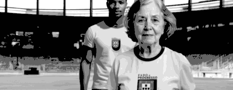
Title of Work: Guiana Brasileira C.F. — Ordem e Confusão / Fado e Progresso
Artist: Dilettante X
Medium: printed cotton jerseys, digital heraldry manipulation
In Guiana Brasileira C.F., Dilettante X imagines a football club that exists not to compete, but to remember — and reimagine. Staged as part of an evolving series of fictional interventions into collective identity, the two jerseys presented here at 1A+ fuse sport, history, and postcolonial reflection into something that feels at once playful and deeply grounded.
The first shirt adopts the colours of Brazil’s national team, but reconfigures the familiar motto “Ordem e Progresso” into “Ordem e Confusão” — a gentle provocation that acknowledges the complexity of shared histories. The coat of arms is no longer national; it is hybrid, recalibrated, straddling two continents and countless narratives. It’s not mockery, but remix — a visual language that speaks fluently in contradiction.
The second shirt, inscribed with “Fado e Progresso,” brings a different kind of tension into play. Here, Portugal’s mournful musical tradition meets the open-ended promise of transformation. If fado evokes longing, then progress — when held with care — can offer renewal. Between past and future, the work holds space for unfinished stories and plural inheritances.
On the back of each shirt, these dialogues deepen. One reads ABRIL, number 22 — a nod to April 22, 1500, the date when Pedro Álvares Cabral’s fleet made landfall in what would be named Brazil. The other, SETEMBRO, number 7 — commemorates September 7, 1822, when Brazil declared independence. These aren't just historical markers. They are coordinates in a shared, if uneasy, constellation.
Rather than propose fixed meanings, Dilettante X invites us into a game without final whistle — one where memory and identity remain in motion. Guiana Brasileira C.F. isn’t a satire of nationalism, but a poetic call for new kinds of belonging. The shirts function as soft monuments — wearable reminders that culture is not inherited, but composed, contested, and always in rehearsal.
Here, football is not escape. It’s dialogue. History is not baggage. It’s material. Confusion, in this context, is not disorder — it’s possibility.
Note: (locker room graffiti, unsigned): "In Guiana Brasileira, there’s no final. Just extra time. And space to play."
⸻
June 2025
Title of Work: Cuidado — Cão Perigoso
Artist: Koloman Santo
Medium: mixed media (wood, metal, paper)
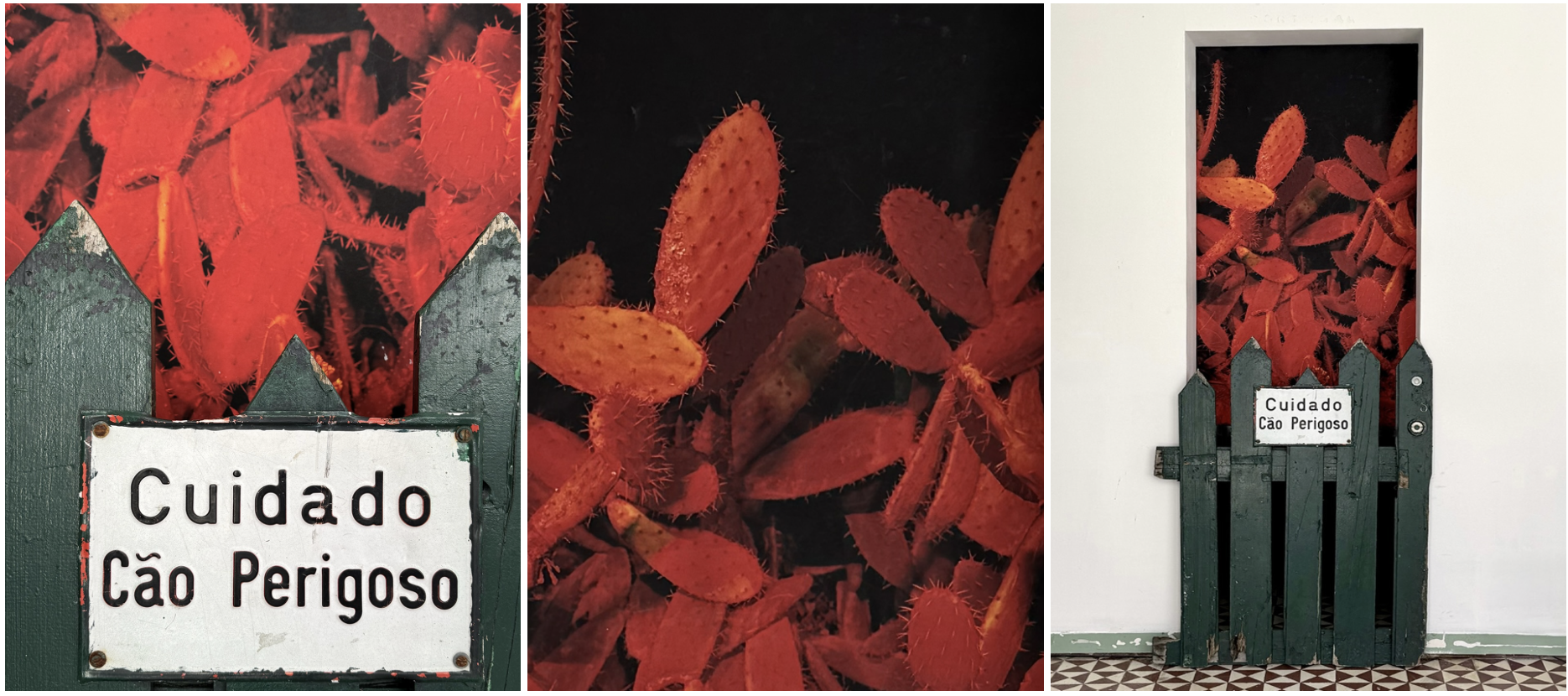
Koloman Santo assembles a tension-charged dialogue between found object and photographic backdrop. A salvaged green wooden gate, weathered and splintered, stands guard in front of a glowing red cactus-scape — a nightvision photograph by Lisbon-based photographer @wide.boy, first exhibited at @mercado.amour, hosted by @factory_lisbon.
Affixed to the gate is a small metal sign that reads: Cuidado — Cão Perigoso (Beware of Dog). The warning, absurd and poignant, recontextualizes the prickly cacti behind as potential threat, menace, or perhaps misunderstood guardian. The surreal juxtaposition — sign, gate, and photo — provokes a quiet discomfort. The green of the gate seems to dissolve into the saturated reds of the cactus scene, blurring boundaries between foreground and background, reality and hallucination, menace and metaphor.
The piece hovers between irony and sincerity, inviting us to question what we fence off, what we fear, and what warnings we choose to obey.
⸻
May 2025
Title of Work: CHEGOU — Memory Against Amnesia
Artist: Dilettante X
Medium: A1 poster prints
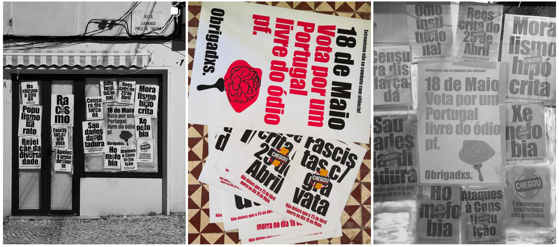
In CHEGOU, artist and cultural agitator Dilettante X reclaims the visual codes of political propaganda to expose, confront, and satirize the rise of the far right in Portugal. The storefront of 1A+ transforms into a wall of dissent: sixteen bold posters, overlapping in urgency, each naming a force of regression that has “arrived” with the mainstreaming of authoritarian discourse — homophobia, racism, censorship, moral panic, populism, and more.
At the heart of the installation is a reimagined logo: CHEGOU, a biting appropriation of the Chega party’s visual identity, turned into a stamp of shame and resistance. Each slogan is marked by this emblem, insisting that behind every form of hate lies the same ideological machinery.
The work draws on the aesthetics of protest vernacular — bold type, stark messages, visual immediacy — but also embraces irony, intelligence, and poetic resistance. The fragmented layout reflects a social reality equally fractured, where democratic values are under threat from within.
Grounding the piece is a simple civic gesture: “May 18 – Vote for a Portugal free of hate”. In this, CHEGOU becomes more than a critique — it becomes a call. A reminder that art can be a tool for memory, for vigilance, for political tenderness.
CHEGOU is not just a graphic protest. It is a cultural alarm. A visual act of memory against forgetting.
Dilettante X rejects cynicism and instead offers, with visual precision and moral clarity, an interventionist art that stands unapologetically for freedom, dignity, and the memory of the April 25 Revolution.
⸻
April 2025
The Archive Has Anxiety History trembles under too many eyes.
What Machines Imagine When We Sleep Dreams in code, flickering and fragile.
Cracks in the Code Where Resistance Blooms A glitch is never just a glitch.
The Grammar of Walls, Wheels, and Rebellion Urban syntax written in motion.
Beauty in Exile, Identity in Motion Aesthetics shaped by departure and return.
Dispatches From the Now-Now Urgency with no time to wait.
Where the Past Whispers Futures Echoes turned roadmaps.
Terrains in Transit, Truths in Tension Nothing stays still long enough to settle.
Tracing Geographies Through Basslines and Static. Between signal and noise, a territory unfolds.
Sleepwalkers of the Signal Field Dreams flicker where the grids misalign.
Time Folds Like Cheap Fabric What frays reveals the real seam.
Ghost Syntax Sentences left behind by vanished tongues.
The Map Wore Out Before the Journey Began Some places can’t be reached — only remembered.
Glass Cities Blink in Morse Translation fails at every pane.
Underneath the Static, a Pulse Nothing ever really disappears.
Echoes Are Instructions for the Lost They don’t guide — they haunt.
Coordinates Written in Salt Erase one wave at a time.
The Error Became the Interface We learned to navigate by glitch.
Dust in the Database Old ghosts still sort the entries.
—
The Archive has Anxiety.